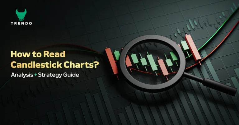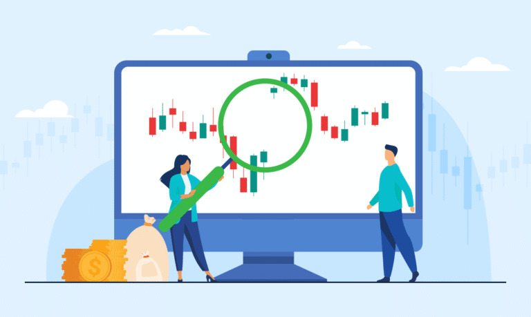

You open a trading platform for the first time. The screen fills with red and green bars, each with thin lines sticking out of the top and bottom. It looks complicated, but it isn’t. What you’re looking at is a candlestick chart. Understanding what is candlestick chart is essential for traders. Within a few minutes of learning how it works, you’ll never want to trade without it.
In this article, you’ll learn what candlestick chart analysis is, how to read every component of a candle, which patterns carry the most weight, and how to apply this knowledge on platforms like Trendo. By the end, you’ll have a working understanding that most beginners spend weeks trying to piece together.
New to trading? Open a free Trendo account and practice reading candlestick charts on live markets, no deposit required.
What Is Candlestick Chart?
So, what is candlestick chart? At its core, it is a type of price chart that shows four key data points for every time period: the opening price, the closing price, the highest price, and the lowest price reached. Each of these data sets is represented visually by a single shape (a “candlestick”), making it possible to assess market behavior at a glance.
The question what is a candlestick individually is equally important: it is a single bar on the chart, made up of a colored body and one or two thin lines (called shadows or wicks) extending above and below. Think of it as a snapshot of the battle between buyers and sellers during that one period.
History of Candlestick Charts (Japanese Origins)
Candlestick charting was developed in Japan during the 1700s by a rice trader named Munehisa Homma, who used it to track price fluctuations in the Dojima Rice Exchange. His insight was simple but powerful: price is not just a number; it carries emotion, and those emotions repeat in recognizable patterns.
The method remained largely unknown in the West until the 1990s, when analyst Steve Nison brought it to global attention. Since then, it has become the standard charting format across virtually every financial market and trading platform in the world.
Why Candlestick Charts Are Popular Among Traders?
Understanding what are candlesticks in trading goes beyond the visual format. Their value lies in the layer of psychological information they reveal, who controlled the market during a given period, how strongly they pushed price, and whether that momentum held by the close.
This is why professional traders prefer candlestick charts over simpler alternatives:
In summary, what is candlestick chart? It provides essential insights into market dynamics and trader psychology.
- Four data points in one visual: open, high, low, and close, all visible at once
- Emotional clarity: large bodies signal conviction; small bodies and long wicks signal uncertainty
- Universal applicability: works on any asset class and any timeframe
- Pattern recognition: decades of documented patterns with consistent predictive value
- Pattern recognition: decades of documented patterns with consistent predictive value, widely studied in technical analysis literature such as research published by institutions like the Corporate Finance Institute (CFI).
Anatomy of a Candlestick: Understanding the Components
Every candlestick has the same three structural elements. Learning to read these instinctively is the foundation of all candlestick analysis.
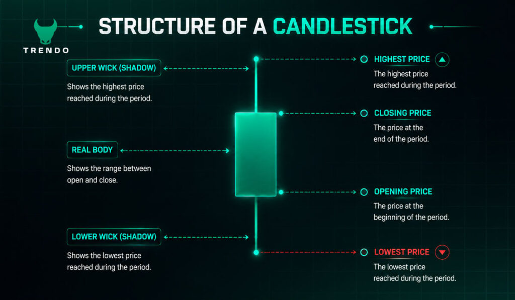
The Candlestick Body (Real Body)
The real body is the wide rectangular section of the candlestick. It spans from the opening price to the closing price for the period. The size of the body tells you how decisive the price move was.
- Large body: significant distance between open and close, strong directional pressure
- Small or narrow body: open and close are close together, indecision or a quiet market
Upper Shadow (Upper Wick)
The thin line above the body is the upper shadow (or upper wick). It marks the highest price reached during the period. A long upper shadow means buyers pushed the price significantly higher at some point, but sellers managed to pull it back down before the candle closed, which is a sign of resistance at higher levels.
Lower Shadow (Lower Wick)
The lower shadow extends below the body and marks the session’s lowest price. A long lower shadow indicates sellers drove price down aggressively, but buyers stepped in, absorbed the pressure, and pushed price back up — a sign of support at lower levels.
Bullish vs Bearish Candlesticks
The color of the body immediately tells you whether the period ended in a buyer or seller victory:
- Bullish candle (green/white): closing price is higher than the opening price, buyers won the session
- Bearish candle (red/black): closing price is lower than the opening price, sellers dominated
Color Coding: Green/White vs Red/Black Candles
Most modern platforms, including Trendo, use green for bullish candles and red for bearish candles by default. A chart filled with large green candles signals sustained buying pressure; a run of large red candles points to seller dominance. The color pattern across multiple candles is often more telling than any single candle in isolation.
The candlestick is not just a price tool, it is a window into the psychology of every trader who participated in that session.
Types of Candlestick Patterns
Now that we’ve established what is candlestick chart structure is, the real power comes from recognizing patterns. A candlestick pattern is a specific arrangement of one, two, or three candles that has historically preceded a particular price move. Patterns are categorized by how many candles form them and what they signal.
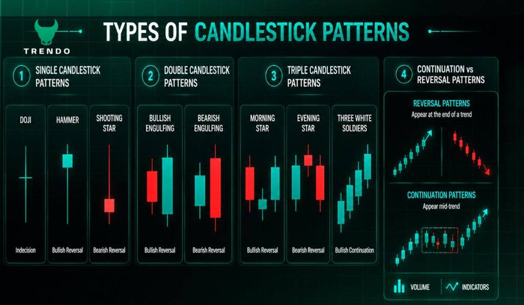
Single Candlestick Patterns
Formed by just one candle, these patterns signal turning points or indecision when they appear at significant price levels. A single candle is enough to shift sentiment when it forms at a key support or resistance zone. Examples include the Doji, Hammer, and Shooting Star, each of which tells a specific story about the balance between buyers and sellers in that session.
Double Candlestick Patterns
Two consecutive candles forming a defined relationship produce a stronger signal than a single candle, because the second candle confirms what the first began. These patterns are particularly useful for identifying reversals. The most well-known examples are the Bullish Engulfing and Bearish Engulfing patterns, where one candle completely overrides the other in both size and direction.
Triple Candlestick Patterns
Three-candle formations give traders the most confirmation before committing to a position. Because they develop over multiple sessions, they reflect a genuine shift in market sentiment rather than a one-time fluctuation. The Morning Star, Evening Star, and Three White Soldiers are the most widely respected patterns in this category.
Continuation vs Reversal Patterns
Reversal patterns appear at the end of a trend and suggest the price direction is about to change. Continuation patterns appear mid-trend and suggest the current move will resume after a brief pause. Identifying which type you’re dealing with — and confirming with volume or other indicators — is essential before acting on any candlestick signal.
Most Important Bullish Candlestick Patterns
Bullish patterns appear during downtrends or at support levels and suggest the price may be about to reverse upward. Here are the five formations every trader needs to recognize.
Hammer Pattern
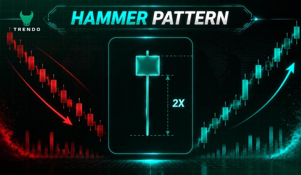
The Hammer has a small body positioned near the top of the candle, with a long lower shadow that is at least twice the body’s length. It appears after a downtrend and tells a clear story: sellers drove price sharply lower during the session, but buyers came in with force and pushed it almost all the way back up before the close.
Key characteristics:
- Small real body at the upper end of the candle
- Lower wick at least 2× the body length
- Little to no upper shadow
- Forms after a sustained downtrend
A Hammer on its own is a warning. A bullish confirmation candle on the following session is what turns it into a high-probability signal. For a complete breakdown of rules and variations, see Trendo’s guide on the Hammer candlestick pattern.
Bullish Engulfing Pattern
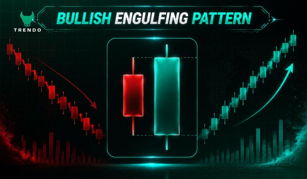
The Bullish Engulfing is a two-candle reversal pattern. The first candle is bearish; the second candle is bullish and its body completely engulfs the first candle’s body, opening lower but closing higher. This shift shows that buyers not only absorbed all selling pressure from the prior session but drove the price even further in their direction.
It carries the most weight when it appears after a prolonged downtrend and at a clearly established support level. Volume confirmation on the second candle adds further strength to the signal.
Morning Star Pattern
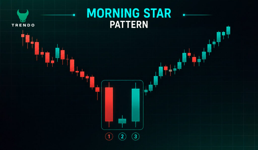
The Morning Star is a three-candle bullish reversal pattern regarded as one of the strongest signals of a downtrend bottom:
- A large bearish candle confirming the existing downtrend
- A small-bodied candle (the ‘star’) that gaps slightly lower — showing indecision and a pause in selling
- A large bullish candle that closes well into the body of the first candle — confirming the reversal
The key element is the middle star candle: it signals that sellers are losing momentum. The third candle confirms buyers have taken control.
Three White Soldiers
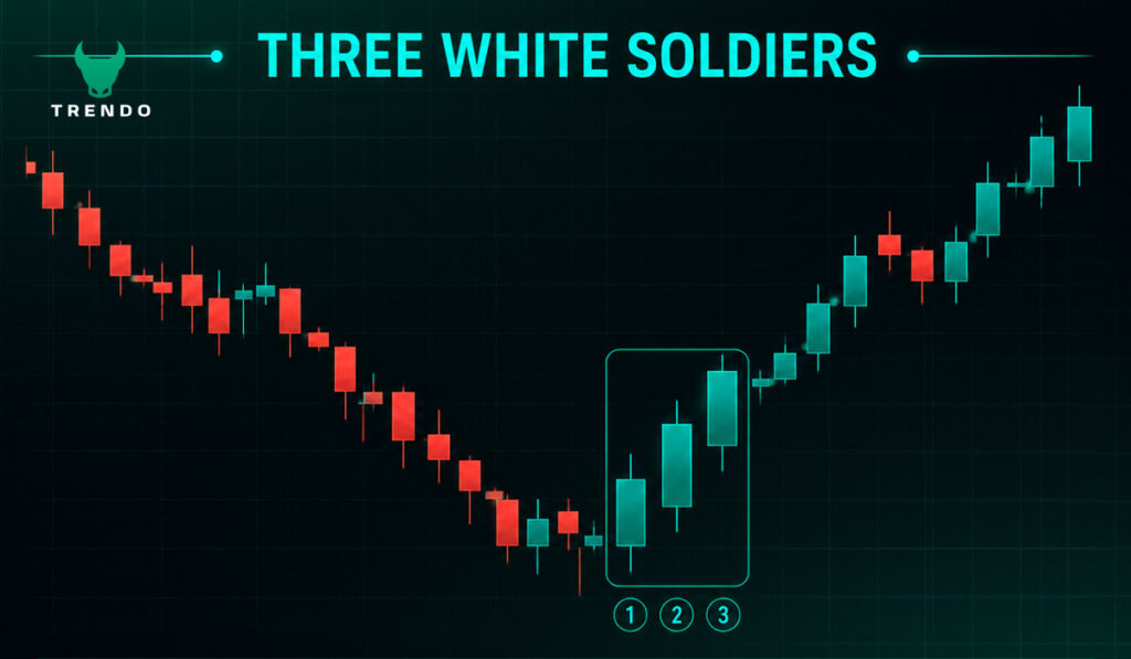
Three consecutive bullish candles, each opening within the previous candle’s body and closing progressively higher. The Three White Soldiers are a powerful signal of sustained buying pressure, especially when they emerge from a base after a prolonged downtrend.
Watch the wick lengths carefully. Small upper wicks on all three candles indicate buyers are firmly in control throughout each session. Large upper wicks suggest buying momentum is starting to fade, and caution is warranted.
Piercing Line Pattern
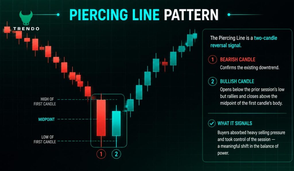
The Piercing Line is a two-candle reversal signal. The first candle is bearish; the second opens below the prior session’s low but then rallies and closes above the midpoint of the first candle’s body. This shows that buyers absorbed heavy selling pressure and took control of the session — a meaningful shift in the balance of power.
Most Important Bearish Candlestick Patterns
Bearish patterns form during uptrends or at resistance levels and warn of potential price declines. These five formations are the most reliable bearish signals in candlestick analysis.
Shooting Star Pattern
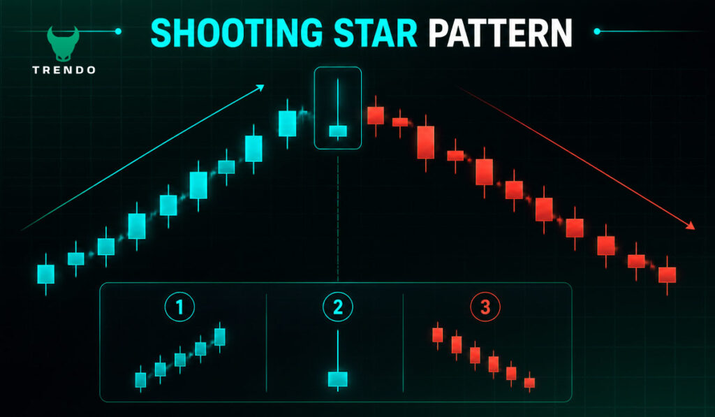
The Shooting Star is the bearish mirror of the Hammer. It has a small body near the bottom of the candle and a long upper shadow, at least twice the body length. After an uptrend, it tells you buyers pushed the price dramatically higher during the session, but sellers overwhelmed them and drove it back down before the close. The result is a candle that signals rejection at higher prices.
Key characteristics:
- Small real body at the lower end of the candle
- Upper wick at least 2× the body length
- Little to no lower shadow
- Forms after a sustained uptrend
Bearish Engulfing Pattern
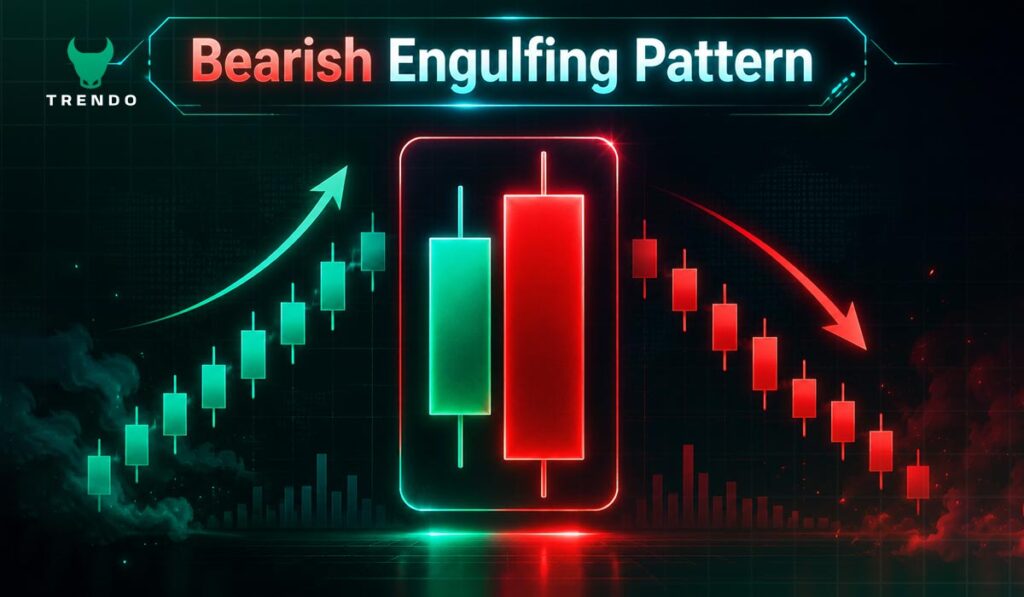
The Bearish Engulfing is the counterpart to the Bullish Engulfing. After an uptrend, a bearish candle completely engulfs the body of the preceding bullish candle. Sellers have fully overpowered buyers and reversed the session’s gains, signaling that the balance of power has shifted downward. The larger the bearish candle relative to the first, the stronger the signal.
Evening Star Pattern
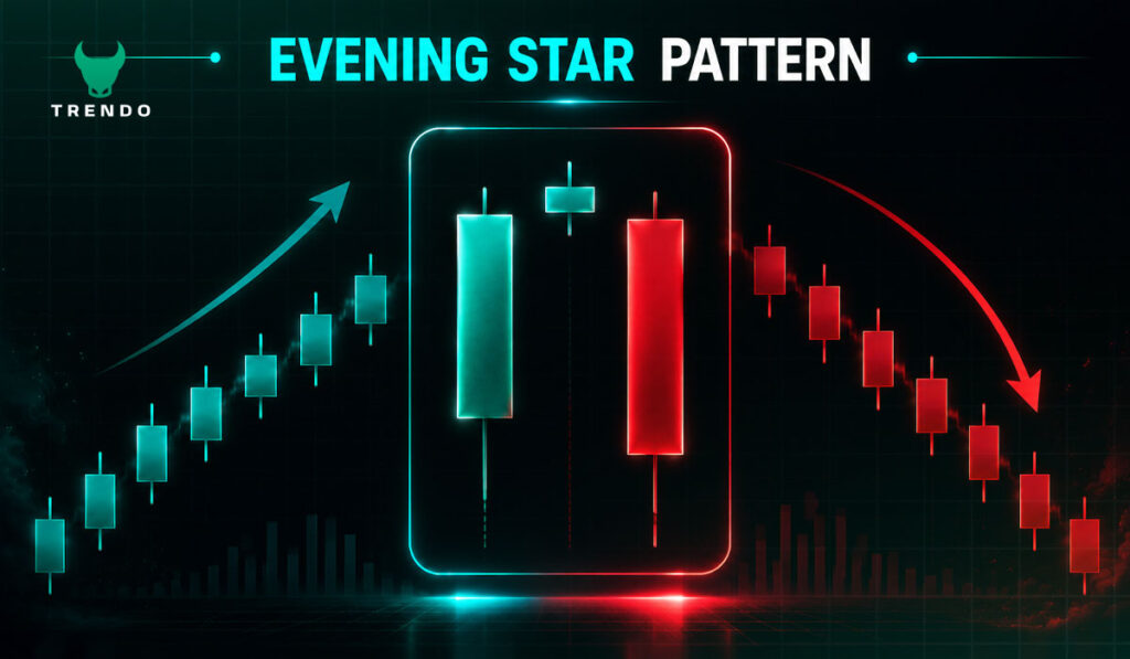
The Evening Star is the three-candle bearish counterpart to the Morning Star:
- A large bullish candle confirming the existing uptrend
- A small-bodied star candle near the top — indecision and fading buying pressure
- A large bearish candle that closes well into the first candle’s body — confirming the reversal
The middle star signals that bulls are running out of fuel. The third candle confirms that sellers have taken the wheel.
Three Black Crows
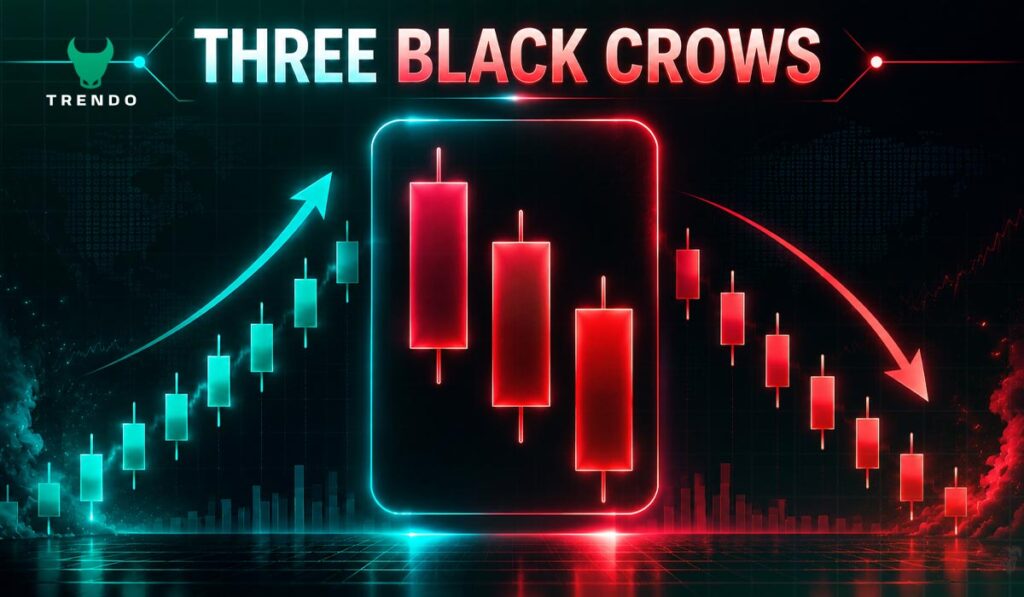
Three consecutive bearish candles, each opening within the prior candle’s body and closing progressively lower. The Three Black Crows signal consistent, sustained selling pressure with little buyer resistance across three full sessions. This pattern is most significant when it appears at the top of an uptrend or near a strong resistance level.
Dark Cloud Cover Pattern
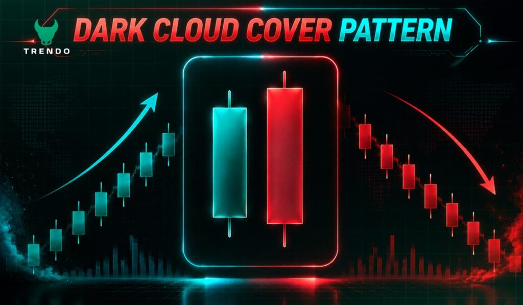
The Dark Cloud Cover is a two-candle bearish signal. The first candle is bullish; the second opens above the prior session’s high but then sells off sharply and closes below the midpoint of the first candle’s body. This dramatic shift, from a strong opening to a weak close, signals that sellers have stepped in aggressively and buying momentum is fading.
Neutral and Indecision Candlestick Patterns
Not every candlestick points clearly in one direction. Indecision patterns appear when neither buyers nor sellers have gained the upper hand. Their significance depends heavily on where they appear — at a key level after a strong trend, they often precede major moves.
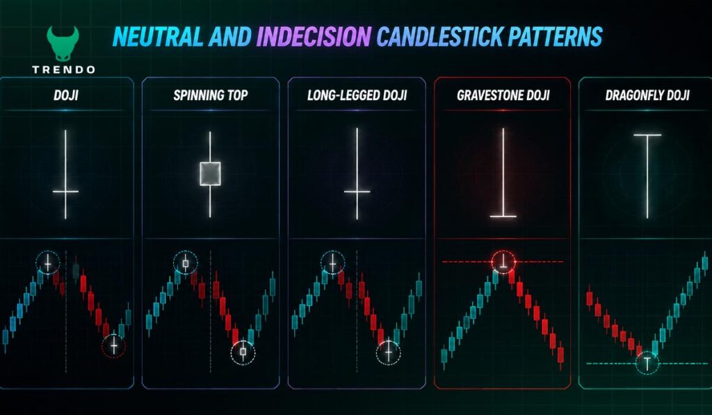
Doji Candlestick
A Doji forms when the opening and closing prices are almost identical, producing a candle with virtually no real body. It represents a session where buying and selling were perfectly balanced — or where neither side had the conviction to push the price in either direction.
A Doji appearing after a sustained trend carries real weight. At the top of an uptrend, it warns that bullish momentum is stalling. At the bottom of a downtrend, it suggests selling pressure may be exhausted. To learn how to build a strategy around each Doji type, read Trendo’s guide on Doji candlestick types and trading strategy.
Spinning Top
The Spinning Top has a small but visible body with roughly equal upper and lower shadows. Like the Doji, it signals indecision — but with slightly more movement between open and close. In a trending market, a Spinning Top often appears just before a reversal or a period of consolidation, warning traders that the current move is losing momentum.
Long-Legged Doji
The Long-Legged Doji has the same near-identical open and close as a standard Doji, but with unusually long shadows in both directions. This signals extreme volatility and indecision — price swung violently in both directions but ultimately settled near where it started. It often precedes a significant directional move, though the direction itself isn’t clear from the pattern alone.
Gravestone and Dragonfly Doji
Two specialized Doji variants with directional implications:
- Gravestone Doji: opens and closes at the session low with a long upper shadow. Sellers rejected every attempt to push the price higher. Often signals a bearish reversal at resistance.
- Dragonfly Doji: opens and closes at the session high with a long lower shadow. Buyers absorbed all selling pressure and pushed the price back to the high. Often signals a bullish reversal at support.
Candlestick Charts vs Other Chart Types
Understanding what is candlestick chart becomes clearer when you compare it directly to the alternatives. Each chart type has its strengths, but candlestick charts consistently offer the most information for active traders.
Candlestick vs Line Charts
A line chart connects only closing prices in a continuous line. It offers a clean, noise-free view of overall trend direction, useful for a quick high-level overview. However, it tells you nothing about intraperiod price behavior: no highs, no lows, no opening price, no sense of volatility or momentum. For traders making decisions, this is a significant blind spot.
Candlestick charts solve this entirely. The same trend direction is visible, but now with the full context of how each session played out.
Candlestick vs Bar Charts
A bar chart (OHLC chart) shows the same four data points as a candlestick — open, high, low, close — using a vertical line with small horizontal ticks. The data is identical, but the visual presentation is less intuitive. Candlestick bodies make directional bias immediately obvious through color and size, while bar charts require more active reading to extract the same information.
This difference matters most when scanning multiple assets. Candlestick charts allow faster pattern recognition under real trading conditions.
Candlestick vs Heikin Ashi Charts
Heikin Ashi is a modified candlestick format that uses averaged price values to reduce chart noise and make trends easier to spot. It is excellent for identifying the broad direction of a trend without being distracted by volatile individual candles.
However, because Heikin Ashi values are calculated — not actual market prices — they are less suitable for precise entry and exit decisions. Standard candlestick charts show real data, which makes them the better choice when accuracy on specific price levels matters. If you want to explore Heikin Ashi in practice, Trendo’s guide on How to Trade Using Heikin Ashi covers it in full.
Which Chart Type Is Best for Beginners?
For anyone learning technical analysis, starting with standard candlestick charts is the right move. The visual encoding of price direction and momentum is intuitive, and the patterns are well-documented and widely taught. Line charts are useful for zooming out to see the big picture, but candlestick charts should be the primary tool for all analysis.
Line charts show you where price went. Candlestick charts show you how it got there — and who was in control along the way.
Ready to put candlestick charts to work? Trendo gives you professional charting tools across forex, indices, and commodities.
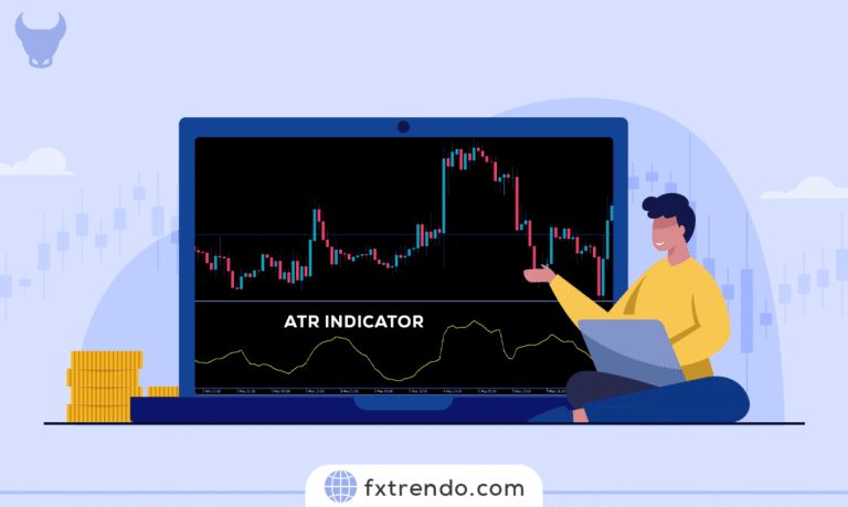
Benefits of Using Candlestick Charts in Trading
Anyone who has researched what is candlestick chart analysis quickly reaches the same conclusion: the advantages over alternative chart types are substantial. Here’s why professional and retail traders rely on them.
Visual Clarity and Easy Interpretation
The colored bodies and clearly defined wicks make it possible to assess market mood at a glance — without reading a single number. Green candles signal buyer strength; red candles signal seller dominance. Large bodies show conviction; small bodies with long wicks signal hesitation. Once this visual language becomes familiar, chart reading becomes fast, almost instinctive.
Provides More Information Than Line Charts
In the same amount of screen space that a line chart uses to display one data point — the closing price — a candlestick chart displays four: open, high, low, and close. That additional context is not decorative; it directly informs decisions about trend strength, volatility, and likely future behavior.
Works Across All Markets and Timeframes
Whether you trade EUR/USD on a 5-minute chart or analyze gold on a weekly timeframe, candlestick charts apply equally well. The patterns and principles don’t change based on the asset or the timeframe — only the context and the weight you assign to each signal shift. This consistency makes candlestick analysis one of the most transferable skills in trading.
Helps Identify Market Sentiment Quickly
Market sentiment — the collective mood of all participants — is difficult to measure directly. Candlestick charts make it visible. A sequence of candles with long lower shadows and small bodies tells you buyers keep absorbing selling pressure at lower levels. A string of large bearish candles with minimal wicks tells you sellers are in complete control with no meaningful resistance. This level of insight is simply not available from a line chart.
Conclusion: Should You Use Candlestick Charts?
Summary of Key Points
By now, you should have a clear understanding of what is candlestick chart and how it works. Here’s a quick recap of everything covered in this guide:
- What is candlestick chart: a price chart built from individual candles, each showing open, high, low, and close for one time period
- Each candle has a real body (open-to-close range) and shadows (session high and low)
- Green/white candles are bullish; red/black candles are bearish
- Patterns range from single-candle signals (Hammer, Doji) to three-candle formations (Morning Star, Three White Soldiers)
- Candlestick charts provide significantly more information than line charts and are more visually intuitive than bar charts
Who Should Use Candlestick Charts?
Candlestick analysis is relevant for virtually every type of market participant:
- Day traders and scalpers: use short-timeframe candles (1m, 5m, 15m) to time precise entries and exits
- Swing traders: rely on 4-hour and daily candles to identify multi-day price moves
- Position traders and investors: use weekly and monthly candles to confirm longer-term trend direction
- Beginners: benefit from the intuitive visual format and the large body of available educational material
Next Steps to Master Candlestick Trading
Reading about candlestick patterns is the foundation. Building real competency requires consistent practice over time:
- Study historical charts and identify patterns before they resolve — this trains pattern recognition
- Always confirm signals with supporting context: support/resistance levels, trend direction, and volume
- Use a demo account to test your pattern reading without risking capital
- Focus on five to seven high-quality patterns rather than trying to memorize dozens
- Keep a trading journal documenting which patterns perform best on your preferred markets and timeframes
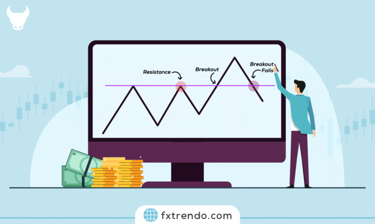
For a full breakdown of how to combine candlestick patterns with support and resistance levels, see Trendo’s guide on how to draw support and resistance levels.
Start applying what you’ve learned about what is candlestick chart today. Open a Trendo account and access professional-grade candlestick charts across 100+ instruments. It’s free to start and create your Account.